Brand Refresh — Before & After
Client: Confidential
The Challenge
The brand had been operating for two years with a logo designed in Canva and visual assets that had accumulated inconsistently over time. Customers recognized the product, but the brand didn't look like the quality of what was inside. A rebrand had been discussed for a year — the team needed someone to finally make it happen without blowing up what they'd already built.
The Approach
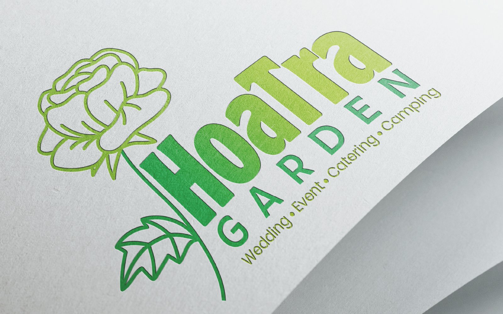
I started with an audit of every existing touchpoint — packaging, social, signage, receipts. The brief was to evolve, not erase. The new identity kept the core of the original concept but sharpened everything: refined logo geometry, a tightened palette, and a type system that works at any scale. The handoff included a side-by-side transition guide so the team could update materials in stages without the brand looking inconsistent mid-transition.
What I Delivered
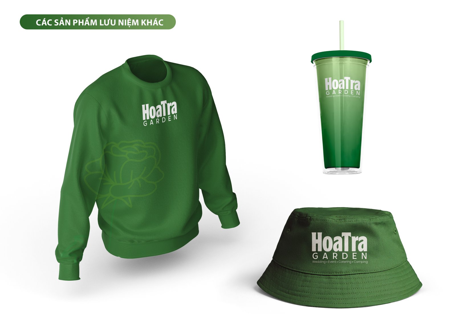
- Brand audit and before/after documentation
- Redesigned logo system (3 variants)
- Updated color palette and typography guide
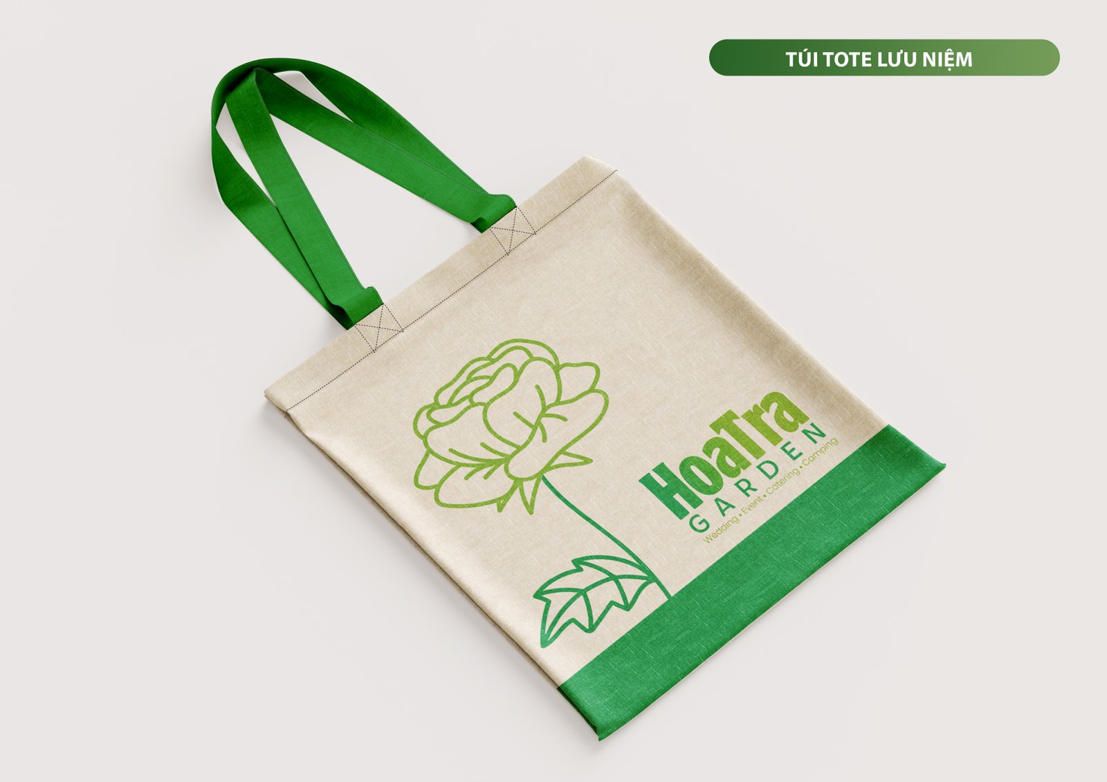
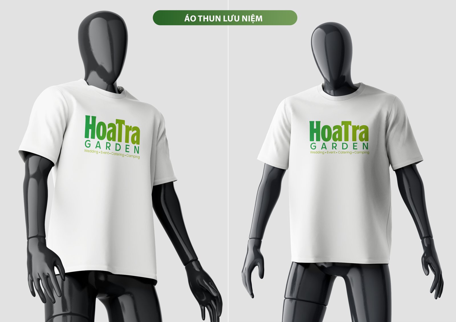
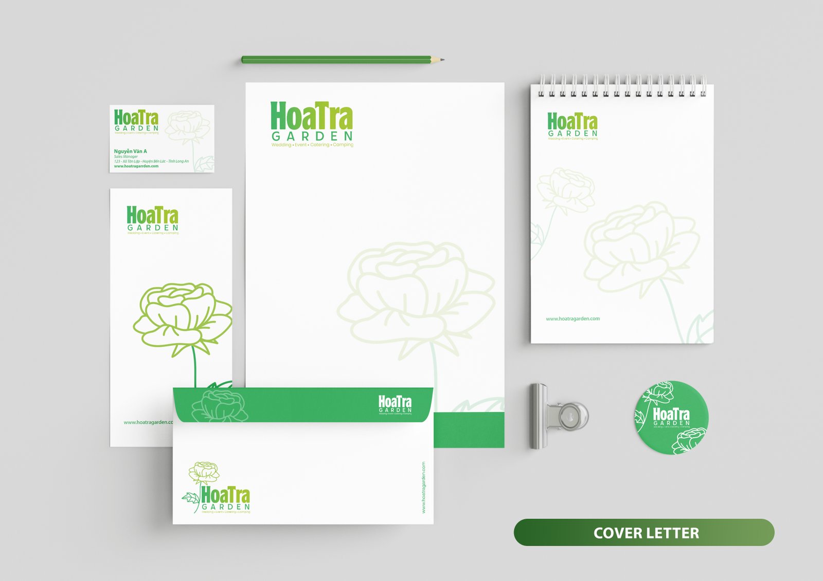
- New brand guideline document
- Transition kit for existing materials
Project Highlights
Rebrand rolled out across packaging and social within 4 weeks of final approval. Before/after comparison became organic content — founder shared the evolution on social and received the highest engagement of any post that month.
Start a project like this.
Tell me about your project — I'll tell you if I can help and what it would cost. No pitch deck, no waiting rooms.