KPOP Petfood — Packaging Design
Client: KPOP Petfood
The Challenge
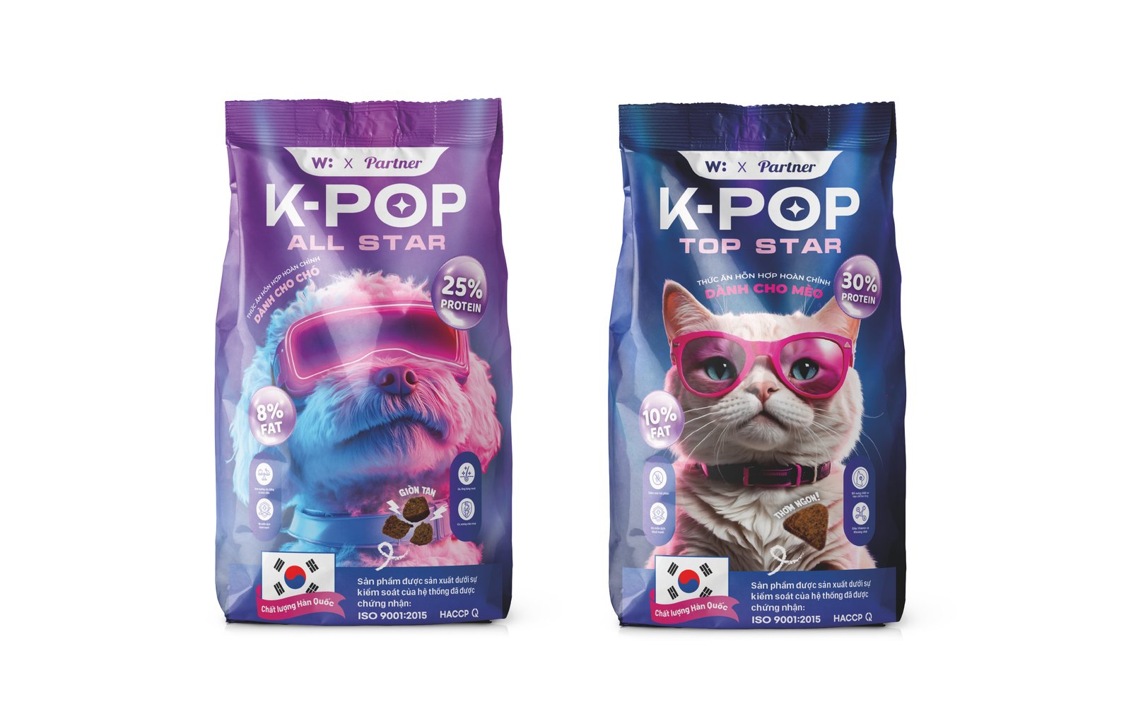
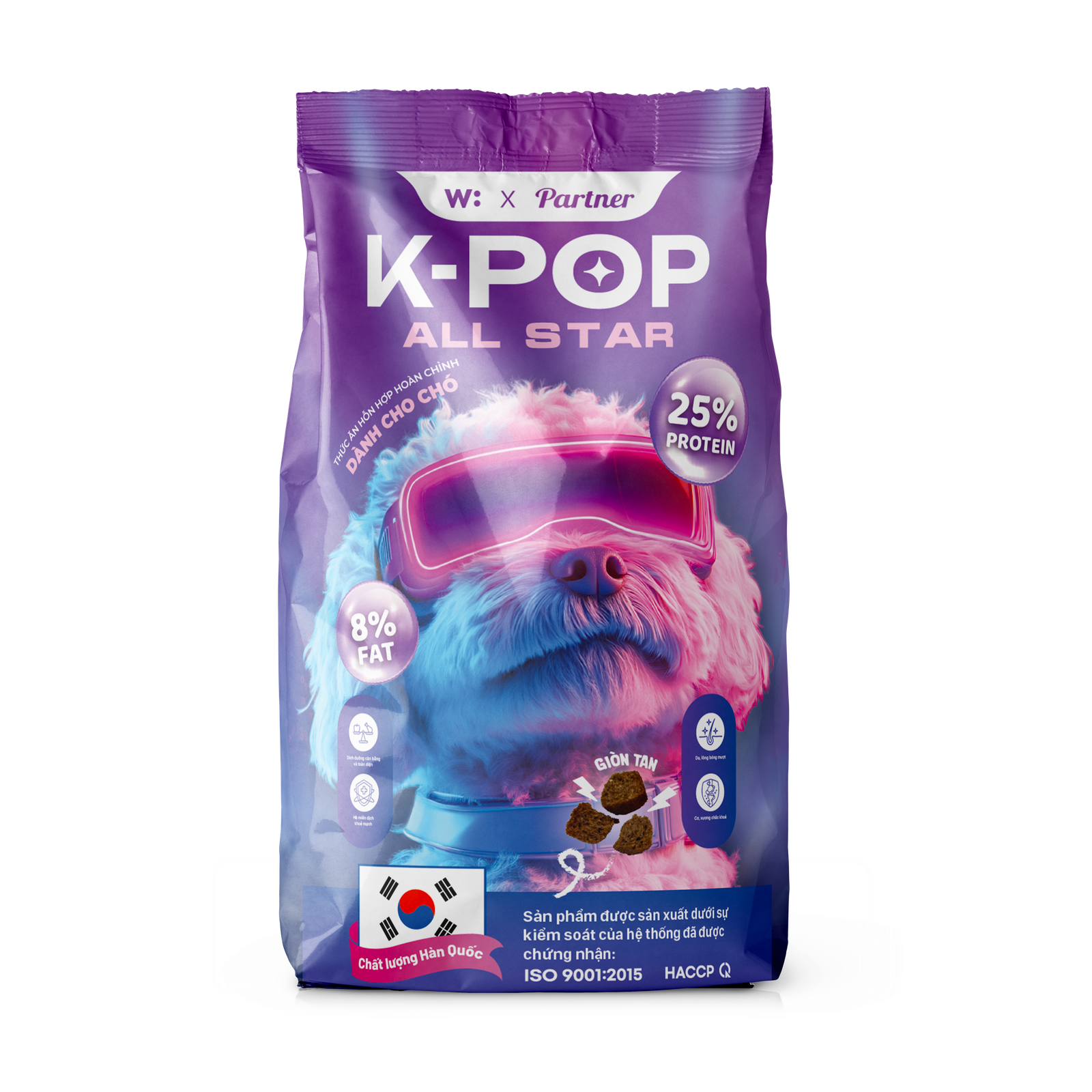
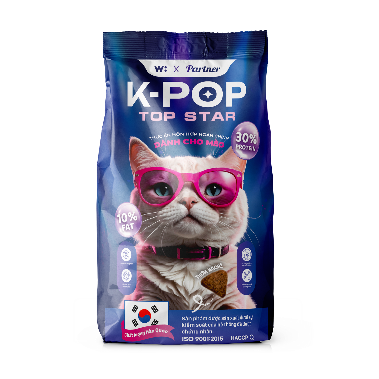
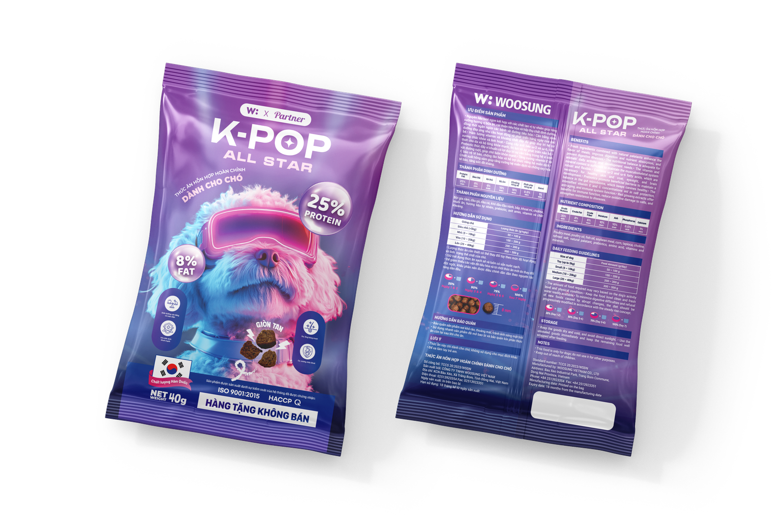
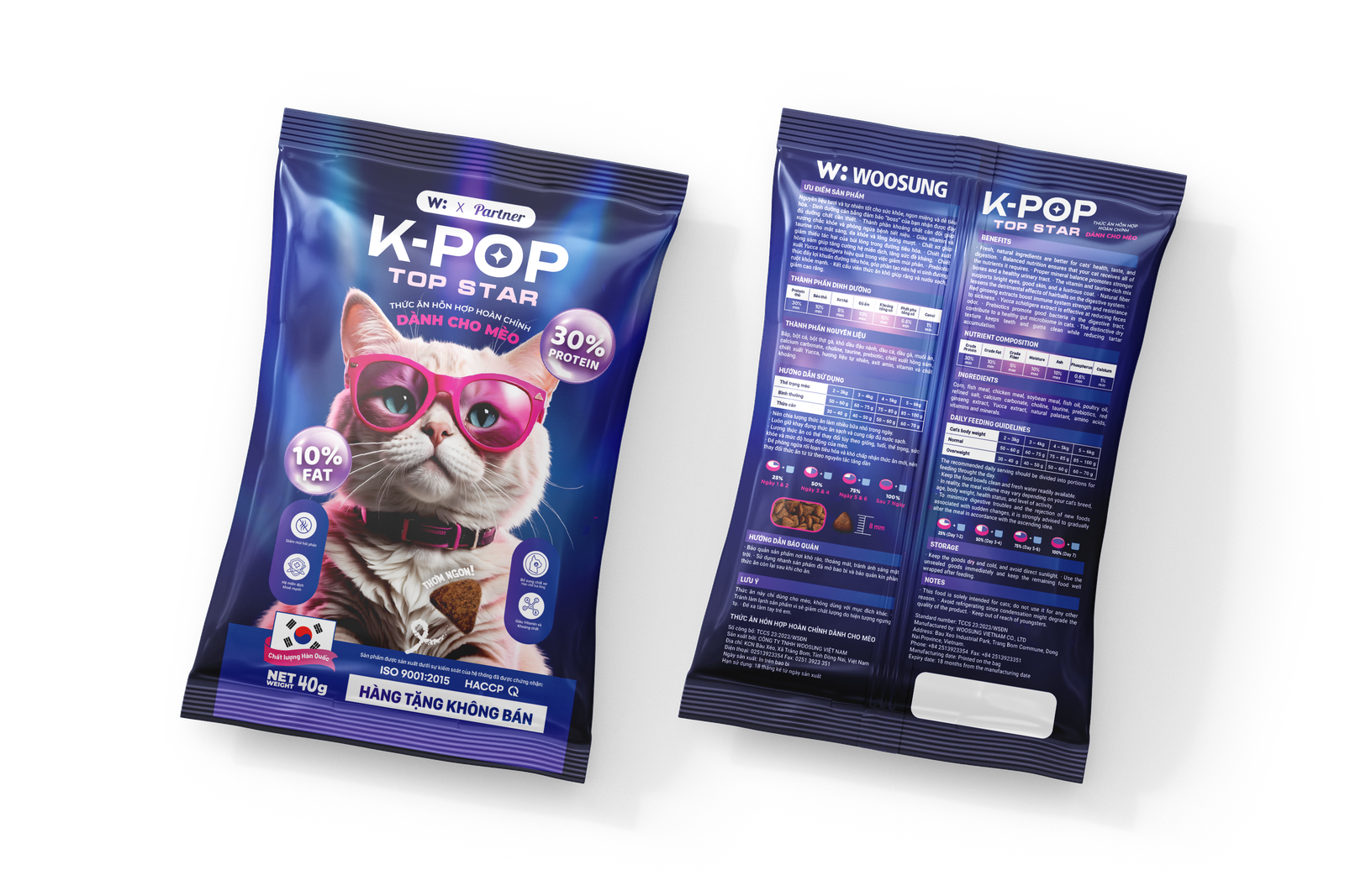
KPOP Petfood needed packaging that stood out on shelf in a market dominated by either clinical white labels or generic cute-animal designs. The brand's K-pop inspired concept was clear in name, but needed a visual identity strong enough to carry it — without leaning into parody.
The Approach
I treated each SKU as its own visual moment while keeping the system coherent across the range. Bold typography, a high-energy color palette, and custom graphic elements pulled from K-pop visual culture — without directly copying any existing IP. Print-ready files were delivered with full bleed, dieline, and production notes.
What I Delivered
- Packaging design for multiple SKUs (print-ready)
- Brand color system and typography for packaging
- Custom graphic elements and illustrations
- Dieline files and production-ready exports
Project Highlights
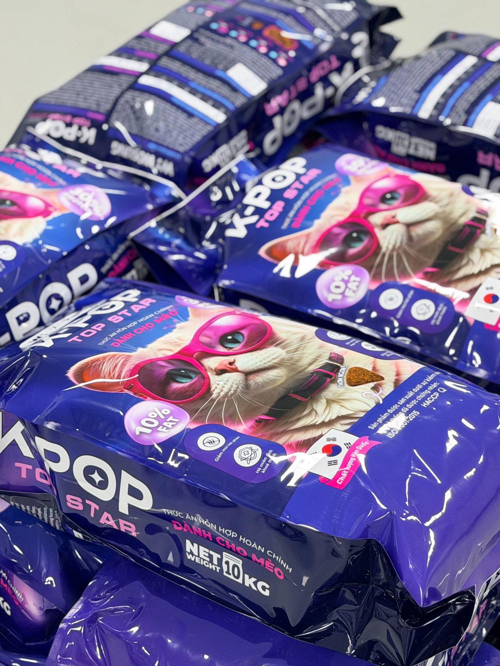
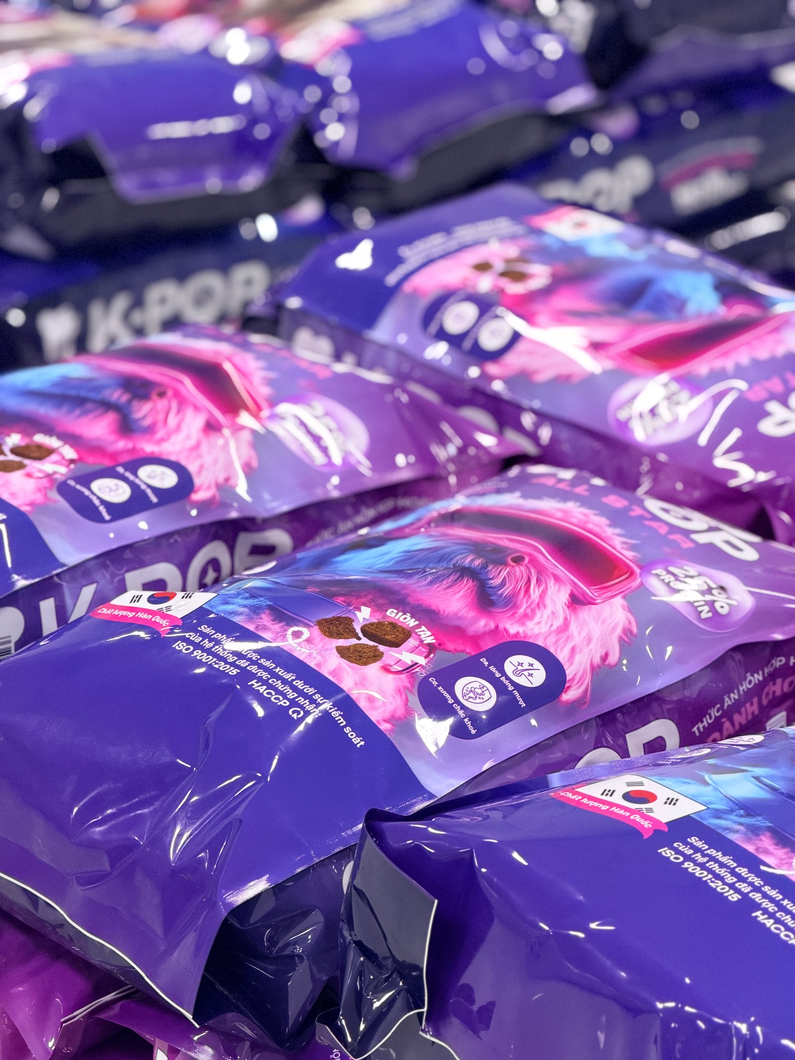
Packaging was produced and shipped to retail within 6 weeks of the first concept presentation. The brand's visual presence on shelf is distinctive enough that customers recognize it without reading the name.
Start a project like this.
Tell me about your project — I'll tell you if I can help and what it would cost. No pitch deck, no waiting rooms.