KPOP Petfood — Packaging Design
Khách hàng: KPOP Petfood
Vấn đề
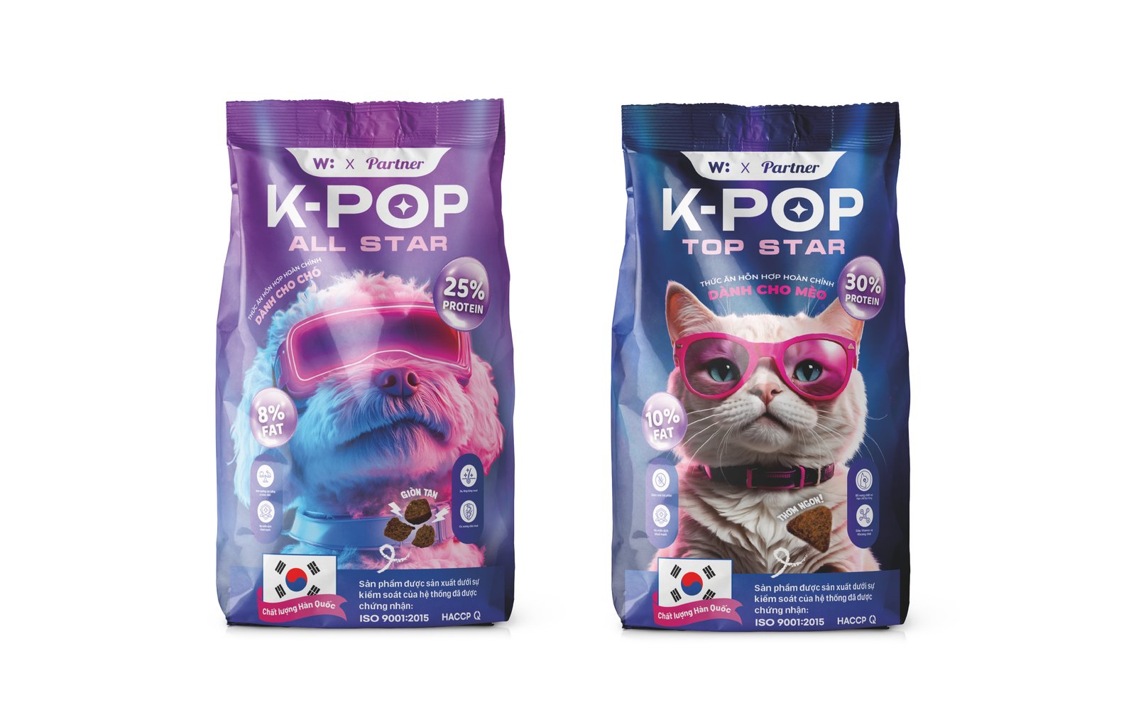
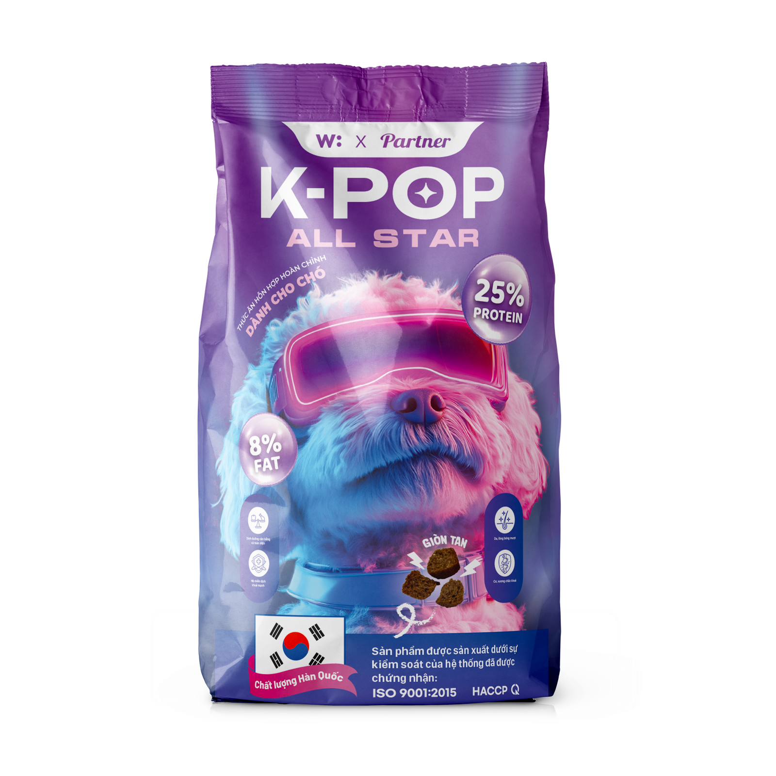
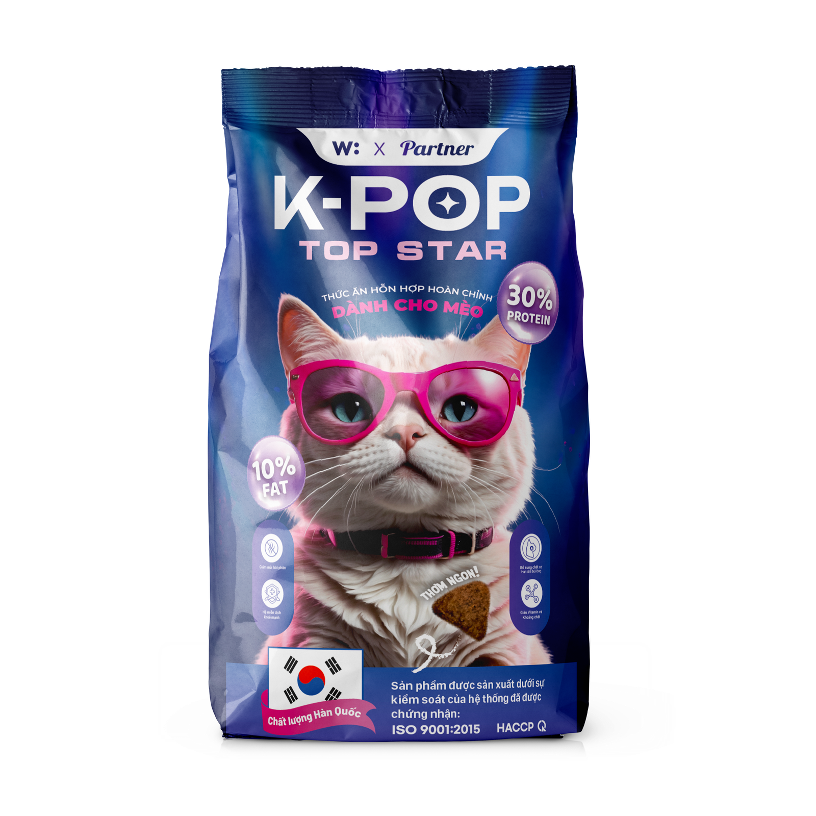
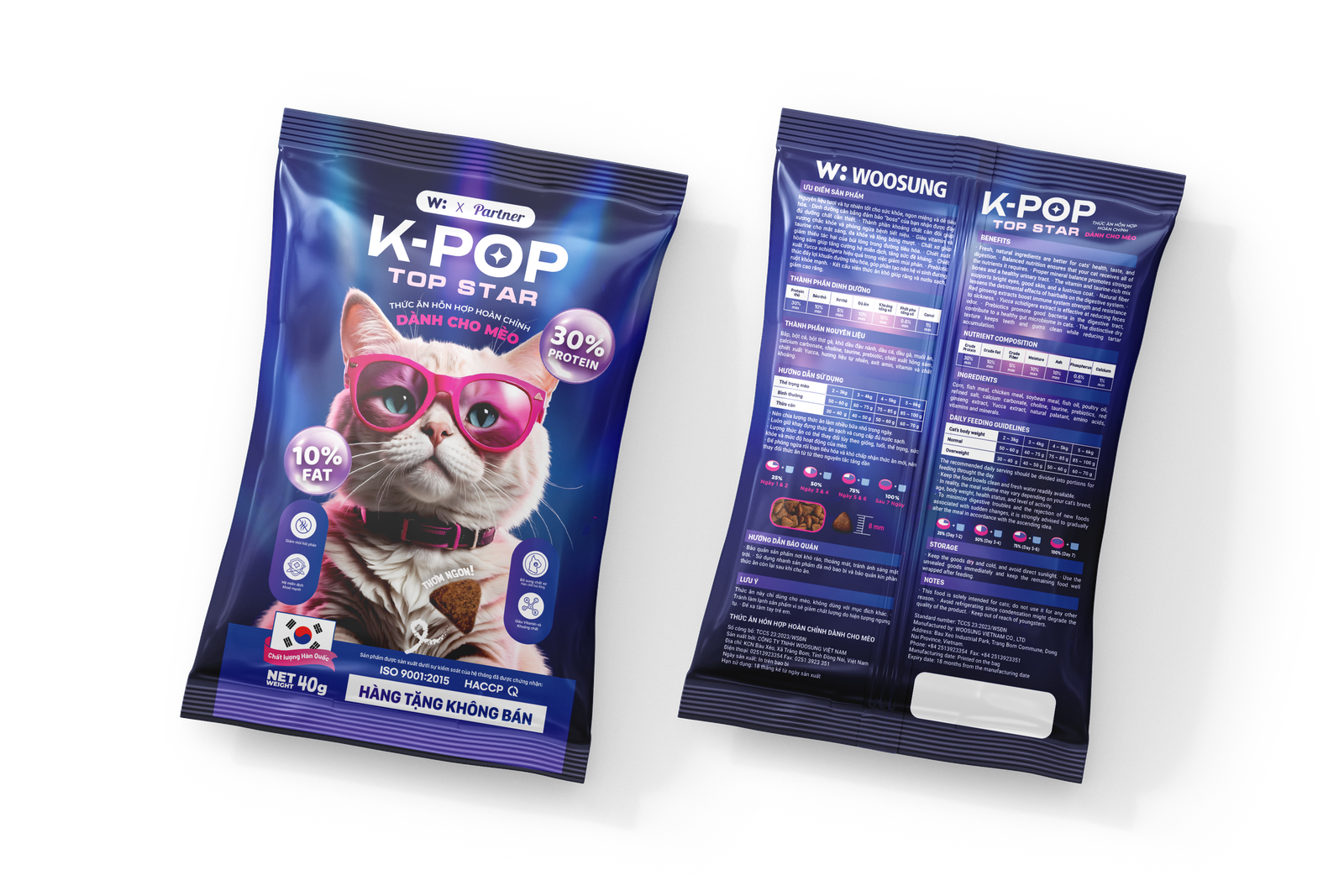
KPOP Petfood needed packaging that stood out on shelf in a market dominated by either clinical white labels or generic cute-animal designs. The brand's K-pop inspired concept was clear in name, but needed a visual identity strong enough to carry it — without leaning into parody.
Hướng tiếp cận
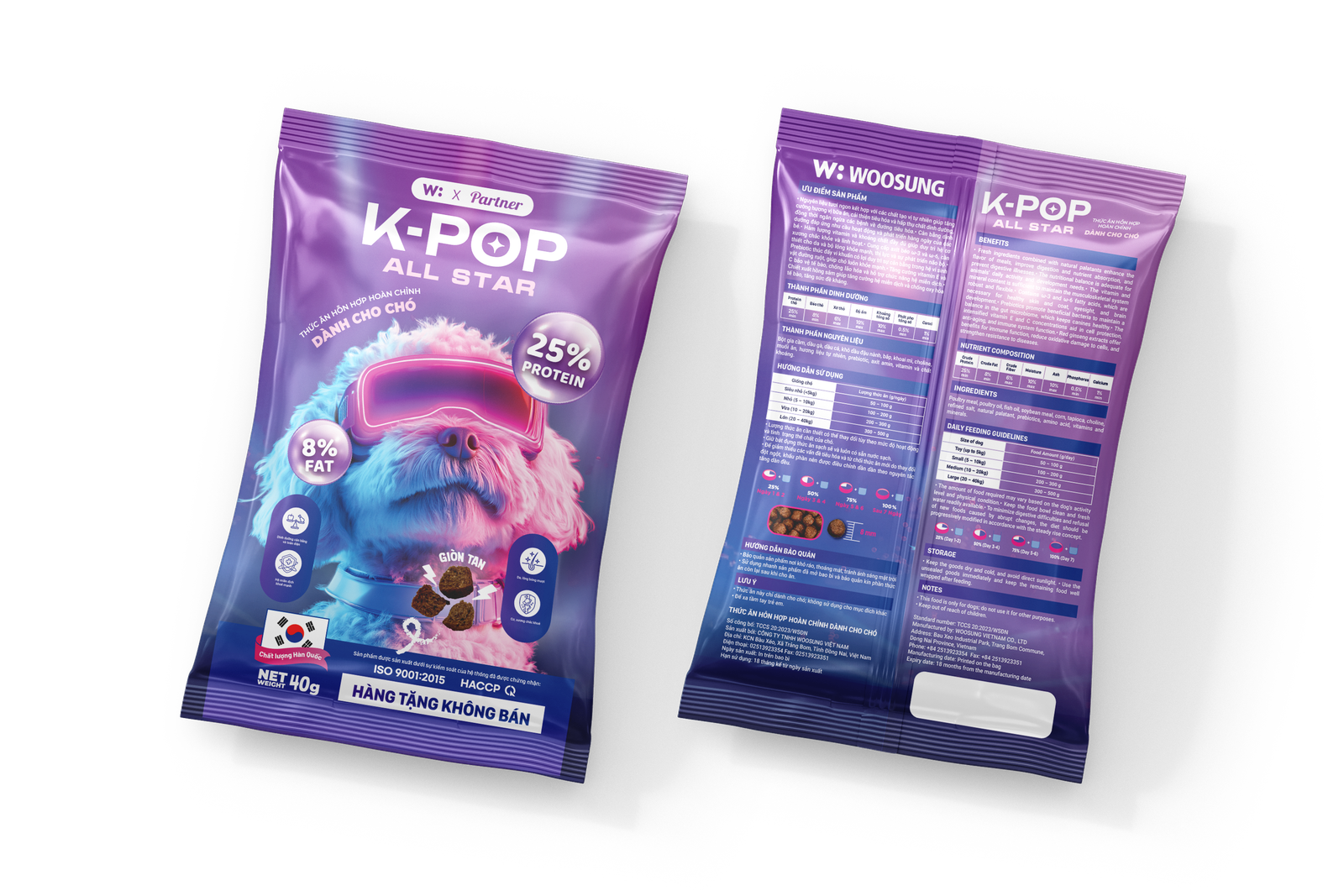
I treated each SKU as its own visual moment while keeping the system coherent across the range. Bold typography, a high-energy color palette, and custom graphic elements pulled from K-pop visual culture — without directly copying any existing IP. Print-ready files were delivered with full bleed, dieline, and production notes.
Những gì mình đã làm
- Packaging design for multiple SKUs (print-ready)
- Brand color system and typography for packaging
- Custom graphic elements and illustrations
- Dieline files and production-ready exports
Điểm nổi bật
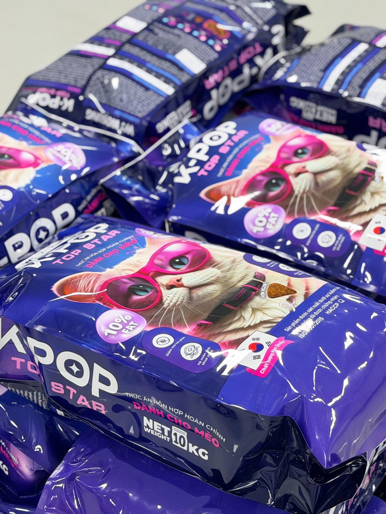
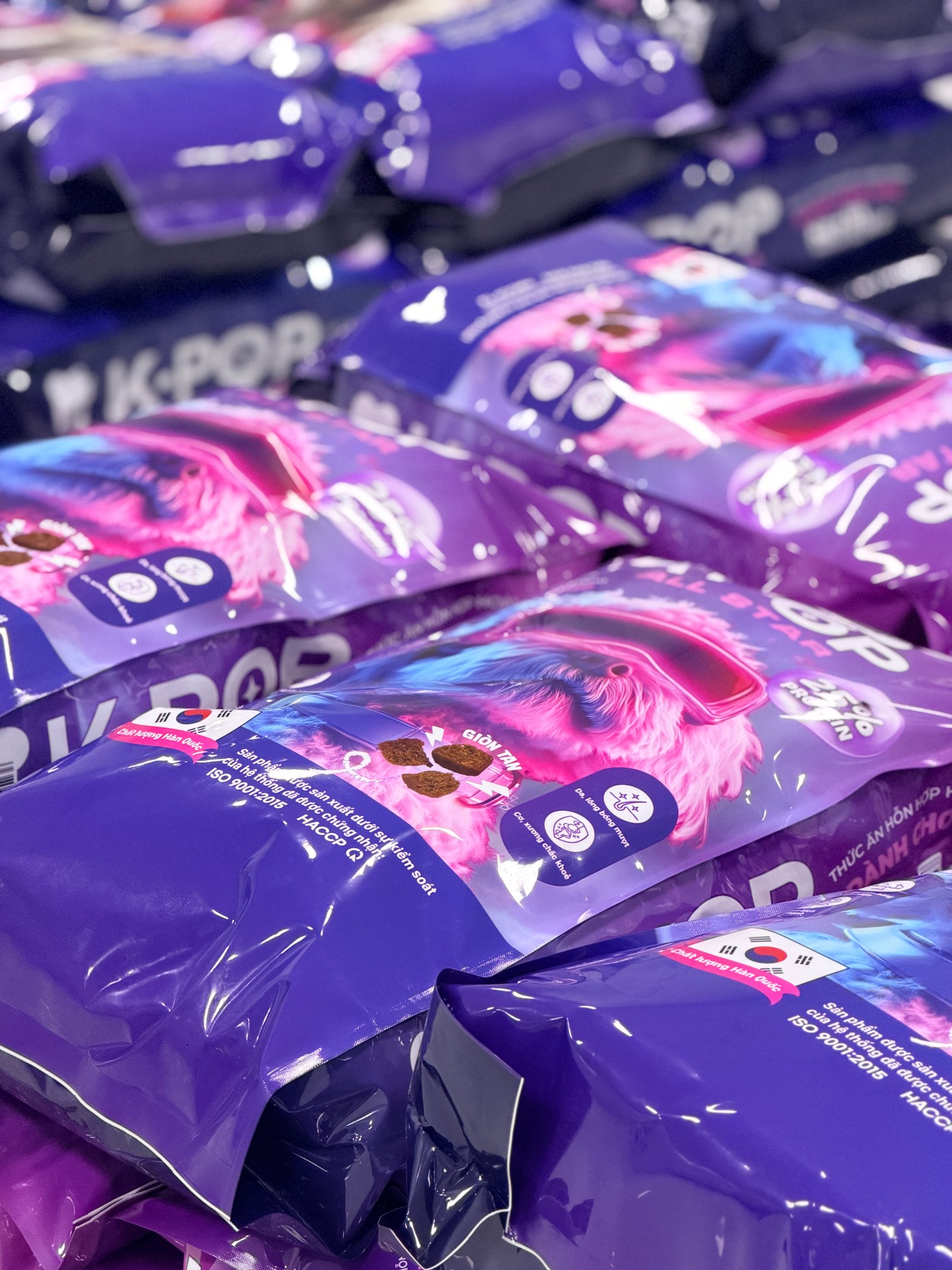
Packaging was produced and shipped to retail within 6 weeks of the first concept presentation. The brand's visual presence on shelf is distinctive enough that customers recognize it without reading the name.
Bắt đầu dự án tương tự.
Kể cho mình nghe về dự án của bạn — mình sẽ nói ngay liệu có thể giúp được không và chi phí bao nhiêu. Không deck, không phòng chờ.